Code
pacman::p_load(seriation, dendextend, heatmaply, tidyverse)| package | R | heatmaply |
| func | heatmap() |
heatmaply() |
| common arguement |
|
|
| Type | static | interactive |
| package | GGally | parallelPlot |
| func | ggparcoord() |
parallelPlot() |
| common arguement |
|
|
| Type | static | interactive |
| package | ggtern | Plotly R |
| func | ggtern() |
plot_ly() |
| common arguement | aes(x, y, z) |
|
| Type | static | interactive |
Heatmaps visualise data through variations in colouring. When applied to a tabular format, heatmaps are useful for
cross-examining multivariate data, through placing variables in the columns and observation (or records) in row and colouring the cells within the table.
show variance across multiple variables, revealing any patterns, displaying whether any variables are similar to each other, and for detecting if any correlations exist in-between them.
There are many R packages and functions can be used to drawing static heatmaps, they are:
heatmap()of R stats package. It draws a simple heatmap.
heatmap.2() of gplots R package. It draws an enhanced heatmap compared to the R base function.
pheatmap() of pheatmap R package. pheatmap package also known as Pretty Heatmap. The package provides functions to draws pretty heatmaps and provides more control to change the appearance of heatmaps.
ComplexHeatmap package of R/Bioconductor package. The package draws, annotates and arranges complex heatmaps (very useful for genomic data analysis). The full reference guide of the package is available here.
superheat package: A Graphical Tool for Exploring Complex Datasets Using Heatmaps. A system for generating extendable and customizable heatmaps for exploring complex datasets, including big data and data with multiple data types. The full reference guide of the package is available here.
For this exercise, 2 methods will be covered
code chunk below to install and launch seriation, heatmaply, dendextend and tidyverse in RStudio.
pacman::p_load(seriation, dendextend, heatmaply, tidyverse)World Happines 2018 report will be used. The original data set is in Microsoft Excel format. It has been extracted and saved in csv file called WHData-2018.csv.
read_csv() of readr is used to import WHData-2018.csv into R and parsed it into tibble R data frame format.
wh <- read_csv("data/WHData-2018.csv")rename rows to country name instead of row number
row.names(wh) <- wh$Countrydata has to be a matrix to make a heatmap. The code chunk below transform wh into a data matrix
wh1 <- dplyr::select(wh, c(3, 7:12))
wh_matrix <- data.matrix(wh)
heatmap() of R stats package draws a simple heatmap.
use heatmap() of Base Stats to plot a heatmap
wh_heatmap <- heatmap(wh_matrix,
                      Rowv=NA, Colv=NA)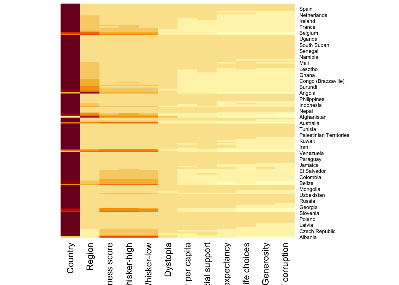
Note:
wh_heatmap <- heatmap(wh_matrix)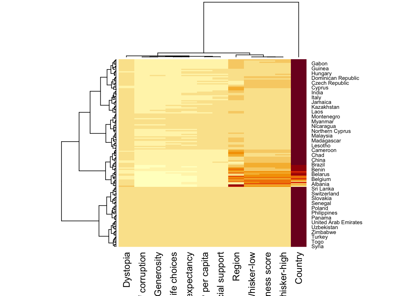
Note:
However, this heatmap is not really informative as the Happiness Score variable have relatively higher values, what makes that the other variables with small values all look the same. Thus, we need to normalize this matrix.
wh_heatmap <- heatmap(wh_matrix,
                      scale="column",
                      cexRow = 0.6,
                      cexCol = 0.8,
                      margins = c(10, 4))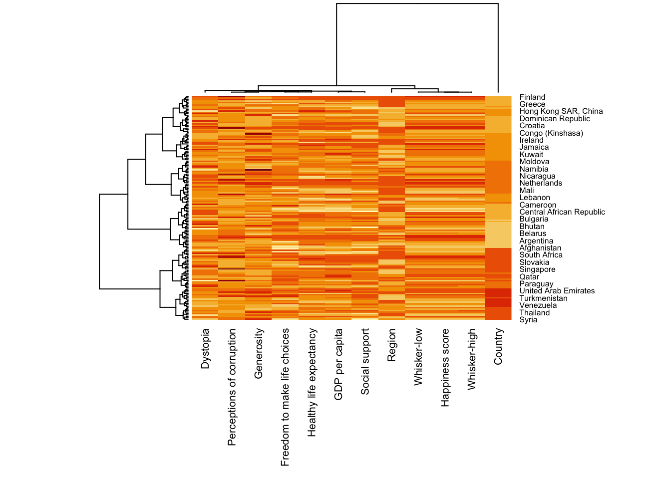
Notice that the values are scaled now. margins argument is used to ensure that the entire x-axis labels are displayed completely and, cexRow and cexCol arguments are used to define the font size used for y-axis and x-axis labels respectively.
heatmaply is an R package for building interactive cluster heatmap which allows hovering and zooming into a region of the heatmap.
Different from heatmap() of R, for heatmaply() the default horizontal dendrogram is placed on the left hand side of the heatmap. The text label of each raw, on the other hand, is placed on the right hand side of the heat map.
The code chunk creates an interactive heatmap by using heatmaply package.
heatmaply(wh_matrix[, -c(1, 2, 4, 5)])When analysing multivariate data set, it is very common that the variables in the data sets includes values that reflect different types of measurement. In general, these variables’ values have their own range. In order to ensure that all the variables have comparable values, data transformation are commonly used before clustering.
The package offers 3 main data transformation methods, namely: scale, normalise and percentilse to ensure all the variables have comparable values.
When all variables are came from or assumed to come from some normal distribution, then scaling (i.e.: subtract the mean and divide by the standard deviation) would bring them all close to the standard normal distribution.
In such a case, each value would reflect the distance from the mean in units of standard deviation.
The scale argument in heatmaply() supports column and row scaling.
The code chunk below is used to scale variable values columewise.
heatmaply(wh_matrix[, -c(1, 2, 4, 5)],
          scale = "column")
When variables in the data comes from possibly different (and non-normal) distributions, the normalize function can be used to bring data to the 0 to 1 scale by subtracting the minimum and dividing by the maximum of all observations.
This preserves the shape of each variable’s distribution while making them easily comparable on the same “scale”.
Different from Scaling, the normalise method is performed on the input data set i.e. wh_matrix as shown in the code chunk below.
heatmaply(normalize(wh_matrix[, -c(1, 2, 4, 5)]))This is similar to ranking the variables, but instead of keeping the rank values, divide them by the maximal rank.
This is done by using the ecdf of the variables on their own values, bringing each value to its empirical percentile.
The benefit of the percentize function is that each value has a relatively clear interpretation, it is the percent of observations that got that value or below it.
Similar to Normalize method, the Percentize method is also performed on the input data set i.e. wh_matrix as shown in the code chunk below.
heatmaply(percentize(wh_matrix[, -c(1, 2, 4, 5)]))heatmaply supports a variety of hierarchical clustering algorithm. The main arguments provided are:
distfun: distance (dissimilarity) between both rows and columns. Defaults to dist. The options “pearson”, “spearman” and “kendall” can be used to use correlation-based clustering, which uses as.dist(1 - cor(t(x))) as the distance metric (using the specified correlation method).
dist_method default is NULL, which results in “euclidean” to be used. It can accept alternative character strings indicating the method to be passed to distfun. By default distfun is “dist”” hence this can be one of “euclidean”, “maximum”, “manhattan”, “canberra”, “binary” or “minkowski”.
hclustfun: hierarchical clustering when Rowv or Colv are not dendrograms. Defaults to hclust.
hclust_method default is NULL, which results in “complete” method to be used. It can accept alternative character strings indicating the method to be passed to hclustfun. By default hclustfun is hclust hence this can be one of “ward.D”, “ward.D2”, “single”, “complete”, “average” (= UPGMA), “mcquitty” (= WPGMA), “median” (= WPGMC) or “centroid” (= UPGMC).
In general, a clustering model can be calibrated either manually or statistically.
In the code chunk below, the heatmap is plotted by using hierachical clustering algorithm with “Euclidean distance” and “ward.D” method.
heatmaply(normalize(wh_matrix[, -c(1, 2, 4, 5)]),
          dist_method = "euclidean",
          hclust_method = "ward.D")
In order to determine the best clustering method and number of cluster the dend_expend() and find_k() functions of dendextend package will be used.
First, the dend_expend() will be used to determine the recommended clustering method to be used.
wh_d <- dist(normalize(wh_matrix[, -c(1, 2, 4, 5)]), method = "euclidean")
dend_expend(wh_d)[[3]]
dist_methods hclust_methods optim
1 unknown ward.D 0.6137851
2 unknown ward.D2 0.6289186
3 unknown single 0.4774362
4 unknown complete 0.6434009
5 unknown average 0.6701688
6 unknown mcquitty 0.5020102
7 unknown median 0.5901833
8 unknown centroid 0.6338734The output table shows that “average” method should be used because it gave the high optimum value.
Next, find_k() is used to determine the optimal number of cluster.
wh_clust <- hclust(wh_d, method = "average")
num_k <- find_k(wh_clust)
plot(num_k)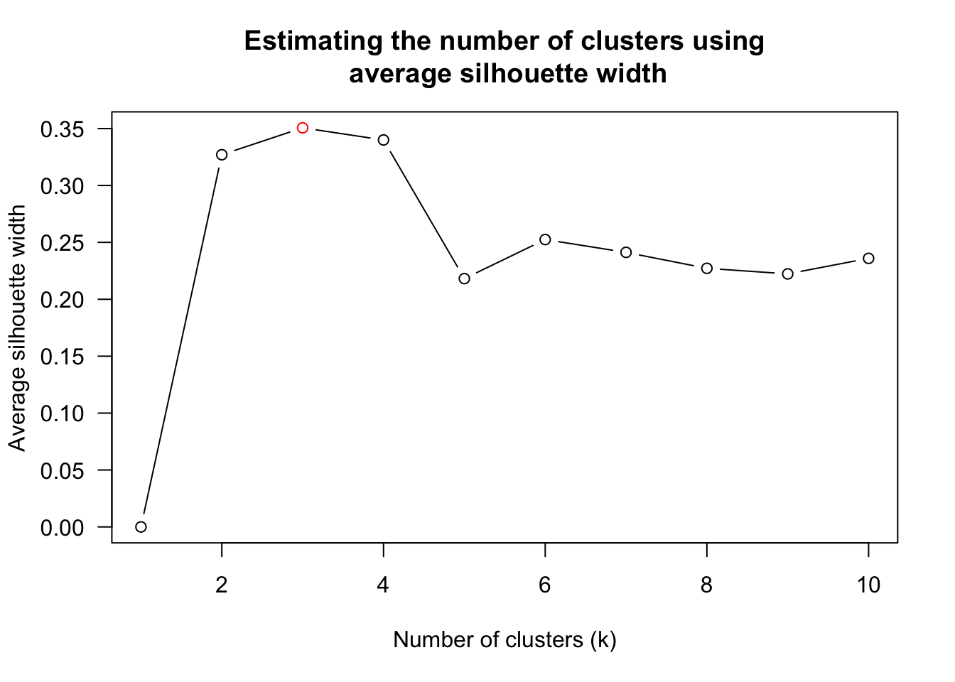
Figure above shows that k=3 would be good.
With reference to the statistical analysis results, we can prepare the code chunk as shown below.
heatmaply(normalize(wh_matrix[, -c(1, 2, 4, 5)]),
          dist_method = "euclidean",
          hclust_method = "average",
k_row = 3)One of the problems with hierarchical clustering is that it doesn’t actually place the rows in a definite order, it merely constrains the space of possible orderings. Take three items A, B and C. If you ignore reflections, there are three possible orderings: ABC, ACB, BAC. If clustering them gives you ((A+B)+C) as a tree, you know that C can’t end up between A and B, but it doesn’t tell you which way to flip the A+B cluster. It doesn’t tell you if the ABC ordering will lead to a clearer-looking heatmap than the BAC ordering.
heatmaply uses the seriation package to find an optimal ordering of rows and columns. Optimal means to optimize the Hamiltonian path length that is restricted by the dendrogram structure. This, in other words, means to rotate the branches so that the sum of distances between each adjacent leaf (label) will be minimized. This is related to a restricted version of the travelling salesman problem.
Here we meet our first seriation algorithm: Optimal Leaf Ordering (OLO). This algorithm starts with the output of an agglomerative clustering algorithm and produces a unique ordering, one that flips the various branches of the dendrogram around so as to minimize the sum of dissimilarities between adjacent leaves. Here is the result of applying Optimal Leaf Ordering to the same clustering result as the heatmap above.
heatmaply(normalize(wh_matrix[, -c(1, 2, 4, 5)]),
          seriate = "OLO")
The default options is “OLO” (Optimal leaf ordering) which optimizes the above criterion (in O(n^4)).
heatmaply(normalize(wh_matrix[, -c(1, 2, 4, 5)]),
          seriate = "GW")
“GW” (Gruvaeus and Wainer) aims for the same goal but uses a potentially faster heuristic
heatmaply(normalize(wh_matrix[, -c(1, 2, 4, 5)]),
          seriate = "mean")
The option “mean” gives the output we would get by default from heatmap functions in other packages such as gplots::heatmap.2.
heatmaply(normalize(wh_matrix[, -c(1, 2, 4, 5)]),
          seriate = "none")
The option “none” gives us the dendrograms without any rotation that is based on the data matrix.
The default colour palette uses by heatmaply is viridis. heatmaply users, however, can use other colour palettes in order to improve the aestheticness and visual friendliness of the heatmap.
In the code chunk below, the Blues colour palette of rColorBrewer is used
heatmaply(normalize(wh_matrix[, -c(1, 2, 4, 5)]),
          seriate = "none",
colors = Blues)Beside providing a wide collection of arguments for meeting the statistical analysis needs, heatmaply also provides many plotting features to ensure cartographic quality heatmap can be produced.
In the code chunk below the following arguments are used:
k_row is used to produce 5 groups.
margins is used to change the top margin to 60 and row margin to 200.
fontsizw_row and fontsize_col are used to change the font size for row and column labels to 4.
main is used to write the main title of the plot.
xlab and ylab are used to write the x-axis and y-axis labels respectively.
heatmaply(normalize(wh_matrix[, -c(1, 2, 4, 5)]),
          Colv=NA,
          seriate = "none",
          colors = Blues,
          k_row = 5,
          margins = c(NA,200,60,NA),
          fontsize_row = 4,
          fontsize_col = 5,
          main="World Happiness Score and Variables by Country, 2018 \nDataTransformation using Normalise Method",
          xlab = "World Happiness Indicators",
          ylab = "World Countries"
          )
Parallel coordinates plot is a data visualisation specially designed for visualising and analysing multivariate, numerical data. It is ideal for comparing multiple variables together and seeing the relationships between them. For example, the variables contribute to Happiness Index. Parallel coordinates was invented by Alfred Inselberg in the 1970s as a way to visualize high-dimensional data. This data visualisation technique is more often found in academic and scientific communities than in business and consumer data visualizations. As pointed out by Stephen Few(2006), “This certainly isn’t a chart that you would present to the board of directors or place on your Web site for the general public. In fact, the strength of parallel coordinates isn’t in their ability to communicate some truth in the data to others, but rather in their ability to bring meaningful multivariate patterns and comparisons to light when used interactively for analysis.” For example, parallel coordinates plot can be used to characterise clusters detected during customer segmentation.
2 methods will be covered:
statistic: ggparcoord() of GGally package
interactive: parallelPlot package
For this exercise, the GGally, parcoords, parallelPlot and tidyverse packages will be used. The code chunks below are used to install and load the packages in R.
pacman::p_load(GGally, parallelPlot, tidyverse)The same World Happinees 2018 will be used and the data frame is named as wh
wh <- read_csv("data/WHData-2018.csv")Code chunk below shows a typical syntax used to plot a basic static parallel coordinates plot by using ggparcoord().
ggparcoord(data = wh,
           columns = c(7:12))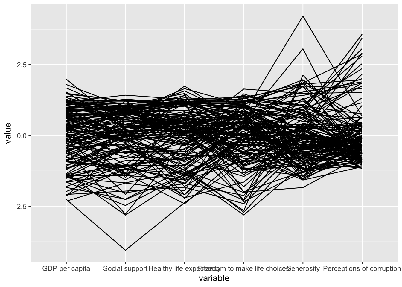
2 argument namely data and columns is used.
The basic parallel coordinates failed to reveal any meaning understanding of the World Happiness measures. Boxplot will be included.
ggparcoord(data = wh,
           columns = c(7:12),
           groupColumn = 2,
           scale = "uniminmax",
           alphaLines = 0.2,
           boxplot = TRUE,
           title = "Parallel Coordinates Plot of World Happines Variables")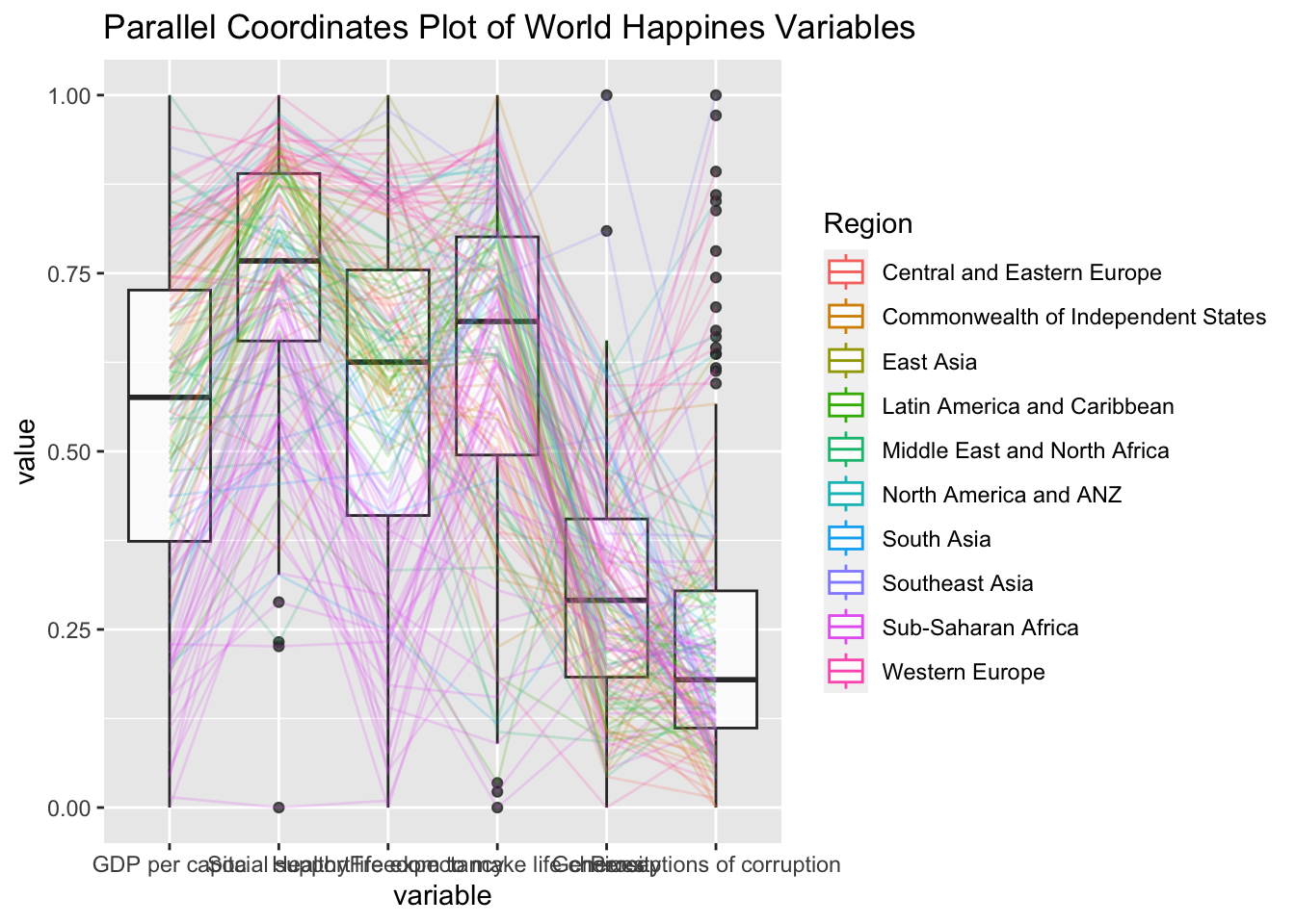
groupColumn : group the observations (i.e. parallel lines) by using a single variable (i.e. Region) and colour the parallel coordinates lines by region name.
scale : scale the variables in the parallel coordinate plot by using uniminmax method. The method univariately scale each variable so the minimum of the variable is zero and the maximum is one.
alphaLines : reduce the intensity of the line colour to 0.2. The permissible value range is between 0 to 1.
boxplot : urn on the boxplot by using logical TRUE. The default is FALSE.
title : provide the parallel coordinates plot a title.
In the code chunk below, facet_wrap() of ggplot2 is used to plot 10 small multiple parallel coordinates plots. Each plot represent one geographical region such as East Asia.
ggparcoord(data = wh,
           columns = c(7:12),
           groupColumn = 2,
           scale = "uniminmax",
           alphaLines = 0.2,
           boxplot = TRUE,
           title = "Multiple Parallel Coordinates Plots of World Happines Variables by Region") +
  facet_wrap(~ Region)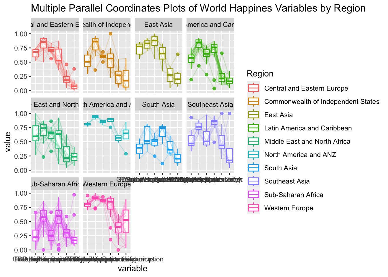
Some of the variable names overlap on x-axis, rotate the labels by 30 degrees using theme() function in ggplot2
ggparcoord(data = wh,
           columns = c(7:12),
           groupColumn = 2,
           scale = "uniminmax",
           alphaLines = 0.2,
           boxplot = TRUE,
           title = "Multiple Parallel Coordinates Plots of World Happines Variables by Region") +
  facet_wrap(~ Region) +
  theme(axis.text.x = element_text(angle = 30))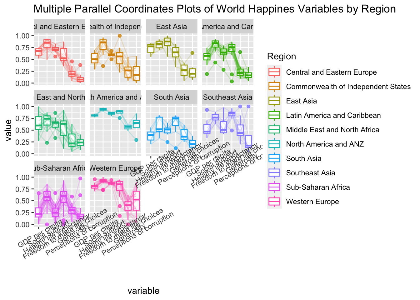
axis.text.x : argument to theme() function. And specify element_text(angle = 30) to rotate the x-axis text by an angle 30 degree.adjusting the text location using hjust argument to theme’s text element with element_text(). axis.text.x is used to change the look of x-axis text.
ggparcoord(data = wh,
           columns = c(7:12),
           groupColumn = 2,
           scale = "uniminmax",
           alphaLines = 0.2,
           boxplot = TRUE,
           title = "Multiple Parallel Coordinates Plots of World Happines Variables by Region") +
  facet_wrap(~ Region) +
  theme(axis.text.x = element_text(angle = 30, hjust=1))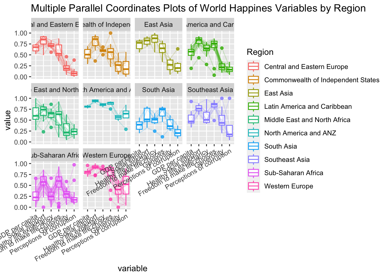
parallelPlot is an R package specially designed to plot a parallel coordinates plot by using ‘htmlwidgets’ package and d3.js. It can build interactive parallel coordinates plot.
The code chunk below plot an interactive parallel coordinates plot by using parallelPlot().
wh <- wh %>%
  select("Happiness score", c(7:12))
parallelPlot(wh,
             width = 320,
             height = 250)
In the code chunk below, rotateTitle argument is used to avoid overlapping axis labels.
parallelPlot(wh,
             rotateTitle = TRUE)
We can change the default blue colour scheme by using continousCS argument as shown in the code chunl below.
parallelPlot(wh,
             continuousCS = "YlOrRd",
             rotateTitle = TRUE)
In the code chunk below, histoVisibility argument is used to plot histogram along the axis of each variables.
histoVisibility <- rep(TRUE, ncol(wh))
parallelPlot(wh,
             rotateTitle = TRUE,
histoVisibility = histoVisibility)Ternary plots visulize the distribution and variability of 3-part compositional data. It’s display is a triangle with sides scaled from 0 to 1. Each side represents one of the 3 components. A point is plotted so that a line drawn perpendicular from the point to each leg of the triangle intersect at the component values of the point.
Method:
ggtern, a ggplot extension specially designed to plot ternary diagrams. The package will be used to plot static ternary plots.
Plotly R, an R package for creating interactive web-based graphs via plotly’s JavaScript graphing library, plotly.js .
Note: Only version 3.2.1 of ggplot2 is compatible with ggtern package
Code chunk below to load the packages.
pacman::p_load(plotly, ggtern, tidyverse)Singapore Residents by Planning AreaSubzone, Age Group, Sex and Type of Dwelling, June 2000-2018 data will be used.
To import respopagsex2000to2018_tidy.csv into R, read_csv() function of readr package will be used.
pop_data <- read_csv("data/respopagsex2000to2018_tidy.csv")use the mutate() function of dplyr package to derive three new measures, namely: young, active, and old.
#Deriving the young, economy active and old measures
agpop_mutated <- pop_data %>%
  mutate(`Year` = as.character(Year))%>%
  spread(AG, Population) %>%
  mutate(YOUNG = rowSums(.[4:8]))%>%
  mutate(ACTIVE = rowSums(.[9:16]))  %>%
  mutate(OLD = rowSums(.[17:21])) %>%
  mutate(TOTAL = rowSums(.[22:24])) %>%
  filter(Year == 2018)%>%
filter(TOTAL > 0)Use ggtern() function of ggtern package to create a simple ternary plot.
ggtern(data=agpop_mutated,aes(x=YOUNG,y=ACTIVE, z=OLD)) +
  geom_point()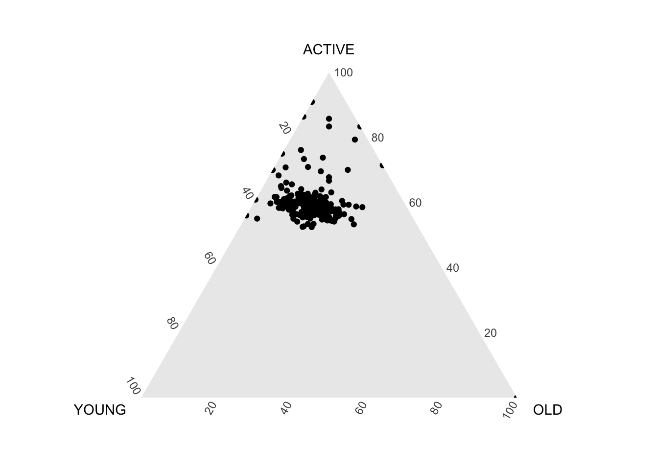
#Building the static ternary plot
ggtern(data=agpop_mutated, aes(x=YOUNG,y=ACTIVE, z=OLD)) +
  geom_point() +
  labs(title="Population structure, 2015") +
  theme_rgbw()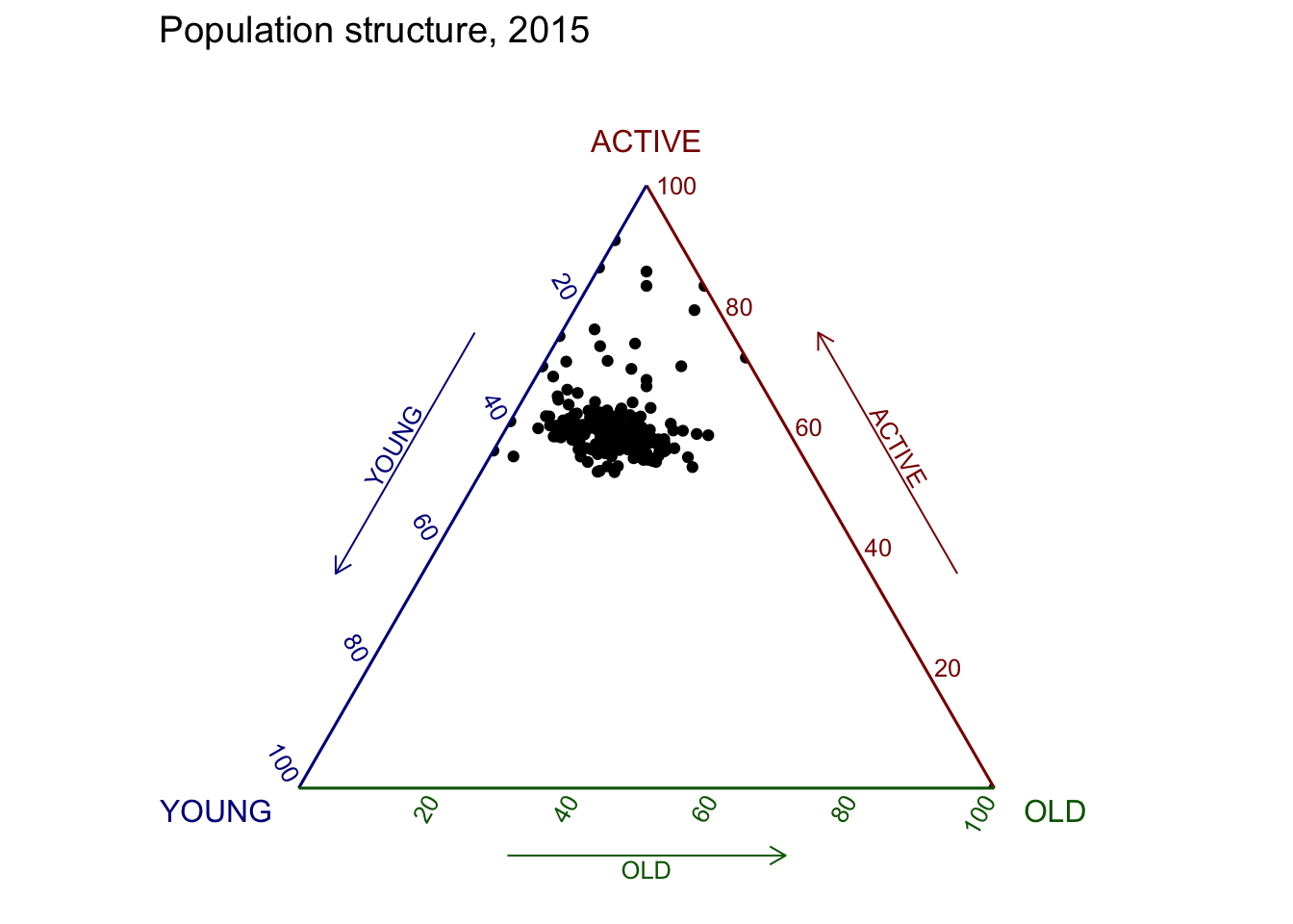
The code below create an interactive ternary plot using plot_ly() function of Plotly R
# reusable function for creating annotation object
label <- function(txt) {
  list(
    text = txt,
    x = 0.1, y = 1,
    ax = 0, ay = 0,
    xref = "paper", yref = "paper",
    align = "center",
    font = list(family = "serif", size = 15, color = "white"),
    bgcolor = "#b3b3b3", bordercolor = "black", borderwidth = 2
  )
}

# reusable function for axis formatting
axis <- function(txt) {
  list(
    title = txt, tickformat = ".0%", tickfont = list(size = 10)
  )
}

ternaryAxes <- list(
  aaxis = axis("Young"),
  baxis = axis("Active"),
  caxis = axis("Old")
)

# Initiating a plotly visualization
plot_ly(
  agpop_mutated,
  a = ~YOUNG,
  b = ~ACTIVE,
  c = ~OLD,
  color = I("black"),
  type = "scatterternary"
) %>%
  layout(
    annotations = label("Ternary Markers"),
    ternary = ternaryAxes
  )