pacman::p_load(plotly, tidyverse,ggplot2,tsibble,igraph,ggraph,
               ggstatsplot,heatmaply, treemap, dplyr,
dtwclust, dtw, cluster, ggdendro)take-home-4-amendment
loading package
loading dataset
bmi <- read_csv("data/bmi_data.csv")
country <- read_csv("data/country_data.csv")
Multi-variant
EDA
Firsly, we need to prepare the data by only filtering numeric values and country columns.
bmi_numeric <- bmi %>%
  select(country, where(is.numeric))
This analysis is cross sectional, so it is necessary to filter data by a particular year, where by year here is an input for the user to select from
filtered_data <- bmi_numeric %>%
  filter(year == 2020) %>%
  select(-year)
The code chunk below use ggcorrmat()from ggstatsplot package to visualize the collinearity between all continuous variables. This step is essential in the selection and filtering of variables for subsequent hierarchical clustering, so that the user can exclude highly correlated variables while building the model.
ggcorrmat(
  data = filtered_data,
  cor.vars = 2:13,
  type = "parametric",
  sig.level = 0.05,
  ggcorrplot.args = list(outline.color = "black",
                         hc.order = TRUE,
                         tl.cex = 11,
                         pch.col = "grey20",
                         pch.cex = 6),
  title = "Correlogram for all variables"
)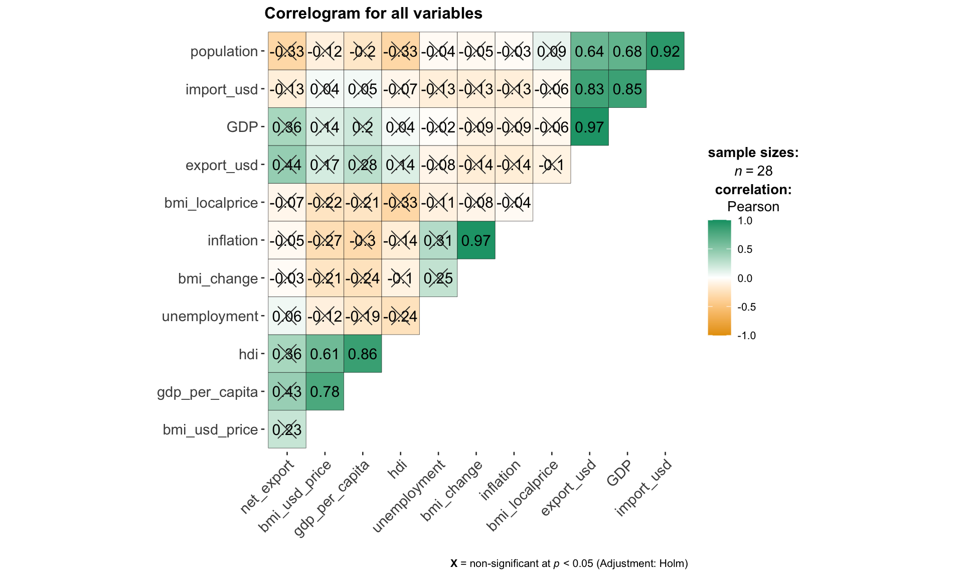
Note
correlation method: Parametric, Nonparametric, Robust, Bayes
type = c(“parametric”, “nonparametric”, “robust”, “bayes”)
using select box
p<0.05, p<0.01
sig.level = c(0.05, 0.01)
using radio box
for any specific relationship to be observed with a scatter plot
ggscatterstats(
  data = filtered_data,
  x = population,
  y = import_usd,
  # title = "Relationship between population and import_usd",
  marginal = FALSE,
  type = "parametric"
  )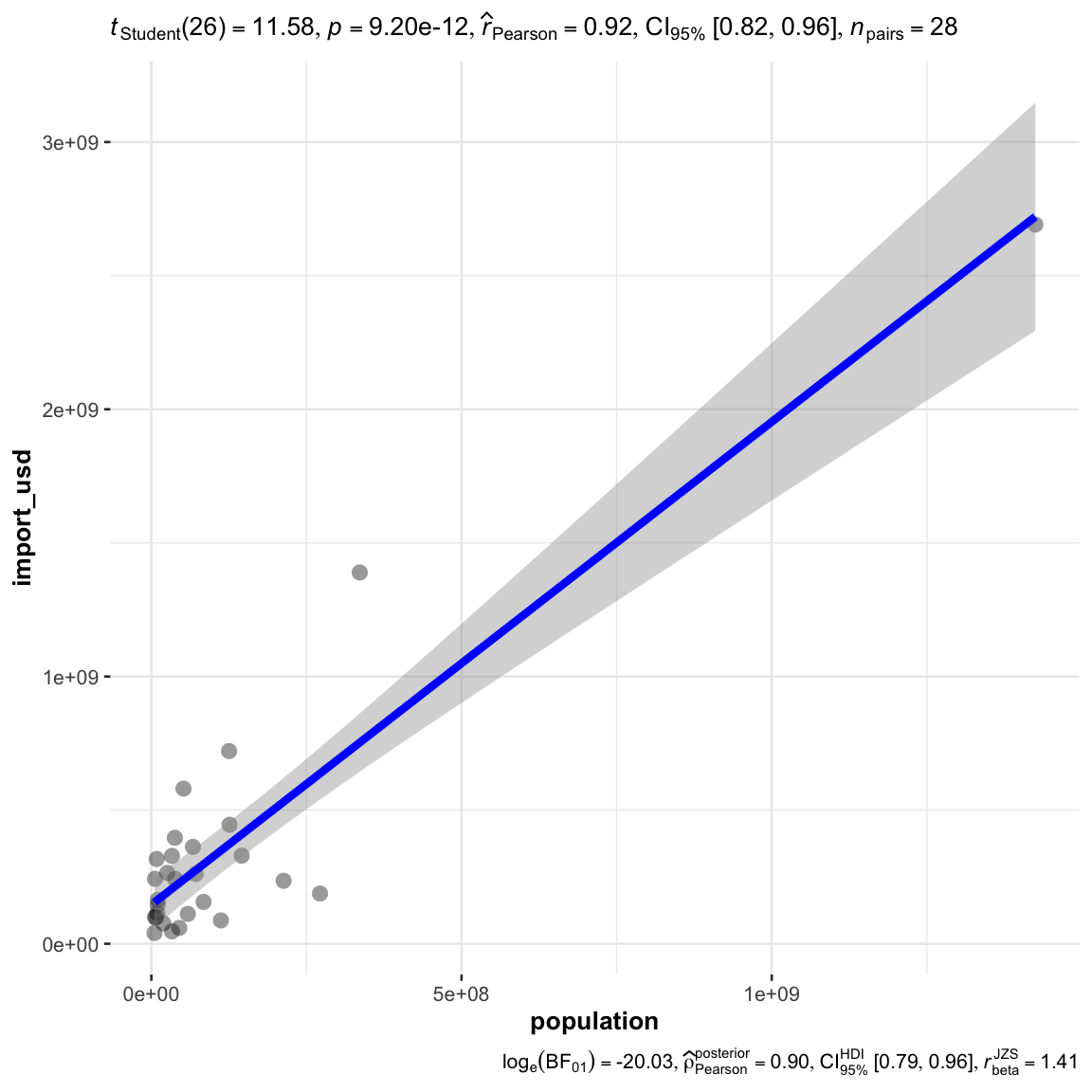
Note
correlation method: Parametric, Nonparametric, Robust, Bayes
type = c(“parametric”, “nonparametric”, “robust”, “bayes”)
using select box
this input should be the shared with the corroplot
Interactivity: potentially when click the corroplot to zoom into the relationship for the particular x and y.
Clustering Calibration
the code should be prepared as a matrix first
# convert to a matrix
row.names(filtered_data) <- filtered_data$country
bmi_heatmap_matrix <- data.matrix(filtered_data)
build model by scale
method = "euclidean"
distance = "complete"heatmaply(bmi_heatmap_matrix,
scale = "col",
dendrogram = 'both',
k_col = 3, # number of cluster in col
k_row = 3, # number of cluster in row
dist_method = method,
hclust_method = distance
)heatmaply(normalize(bmi_heatmap_matrix),
dendrogram = 'both',
k_col = 3, # number of cluster in col
k_row = 3, # number of cluster in row
dist_method = "euclidean",
hclust_method = "complete"
)heatmaply(percentize(bmi_heatmap_matrix),
dendrogram = 'both',
k_col = 3, # number of cluster in col
k_row = 3, # number of cluster in row
dist_method = "euclidean",
hclust_method = "complete"
)
Note
Input: multi-select on all variables
Transformation Type
percentile (default)
scale
normalize
Number of cluster (column):
- k_col = c(2,3,4,5,6)
- slider
Number of cluster (column):
- k_row = c(2,3,4,5)
- slider
Clustering Method
hclust_method = c(“single”, “complete”, “average”, “ward”, “centroid”)
default at complete
selection box
Distance Calculation
- dist_method = c(“euclidean”, “maximum”, “manhattan”, “canberra”, “binary”, “minkowski”)
- default euclidean
- selection box
Clustering Results Visualization
as heatmaply does not provide a value to store the results, can only store it by running the clustering again outside, the input data transformation, method, distance, and k should all the the same as the heatmap
dist_rows <- dist(percentize(bmi_heatmap_matrix),
                  method = method)
hc_rows <- hclust(dist_rows, method = distance)
clusters_rows <- cutree(hc_rows, k = 3)
mv_clusters <- data.frame(country = rownames(bmi_heatmap_matrix), cluster = clusters_rows)
mv_clusters
country cluster
Argentina Argentina 1
Australia Australia 2
Brazil Brazil 1
United Kingdom United Kingdom 3
Canada Canada 2
Chile Chile 1
China China 1
Czech Rep. Czech Rep. 2
Denmark Denmark 2
Hong Kong Hong Kong 2
Hungary Hungary 2
Indonesia Indonesia 1
Japan Japan 1
Malaysia Malaysia 1
Mexico Mexico 1
New Zealand New Zealand 2
Peru Peru 1
Philippines Philippines 1
Poland Poland 1
Russia Russia 1
Singapore Singapore 2
South Africa South Africa 1
Korea Korea 1
Sweden Sweden 2
Switzerland Switzerland 2
Thailand Thailand 1
Turkey Turkey 1
United States United States 3to visualize the map in a treemap
mv_clusters_country <- merge(filtered_data, mv_clusters, by = "country")
treemap(mv_clusters_country,
        index = c('cluster', 'country'),
        vSize = "gdp_per_capita",
        vColor = "bmi_usd_price",
        palette = "RdYlBu",
        type = 'value'
        )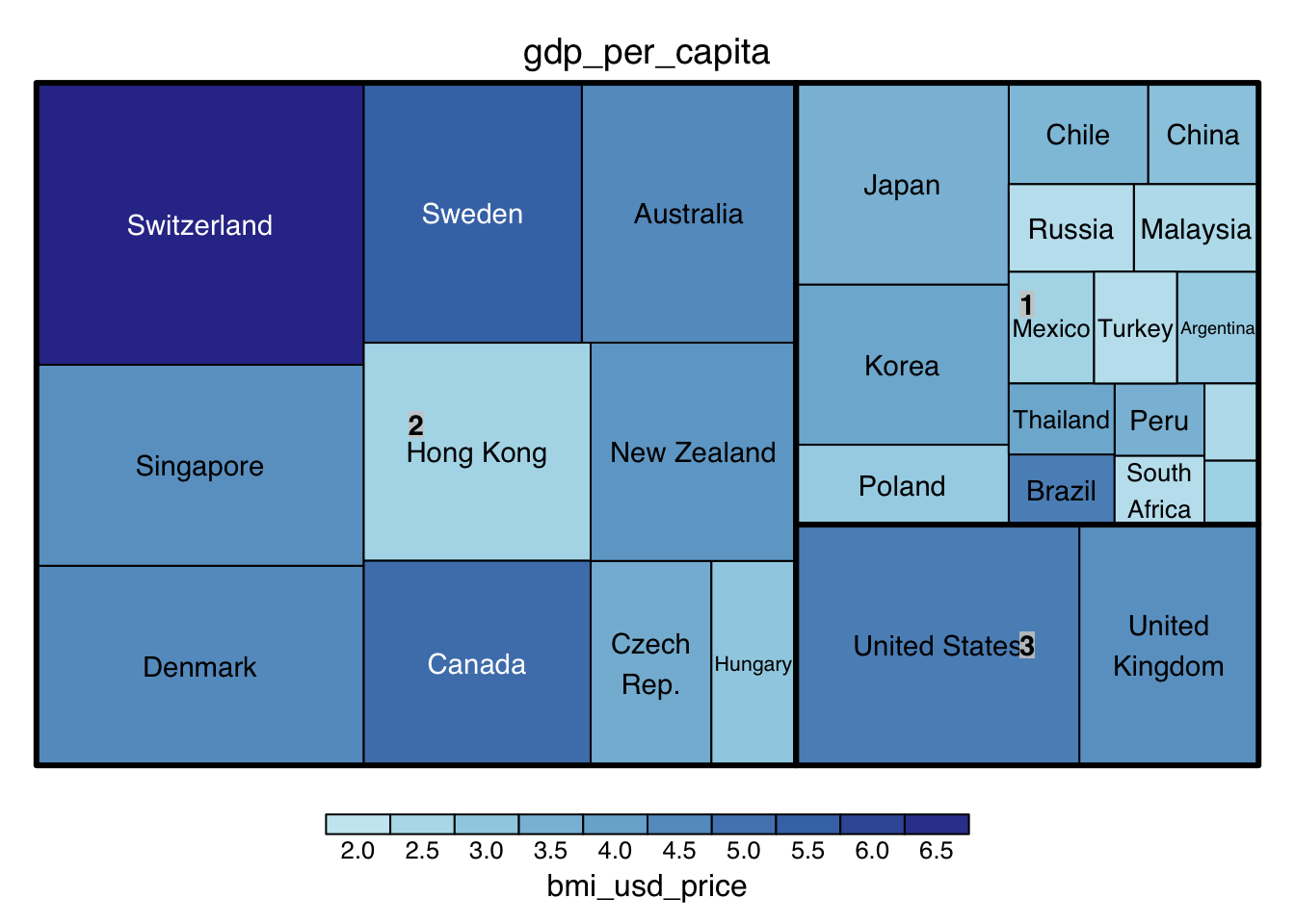
Note: vSize, and vColor are 2 variable input for different indicators for visualization
Time Series
Clustering Calibration
Data Preperation
For time series clustering, the dtwclust package is used, offering various clustering algorithms and tools tailored for time series data.
https://www.linkedin.com/pulse/times-series-clustering-dynamic-time-warping-john-akwei/
filter only country, year, and bmi related columns
# filter country, year, bmi column
bmi_tsc <- bmi %>%
  select(country, year, bmi_usd_price) # bmi_localprice,

# Group by country and convert each group to a matrix
list_matrices_per_country <- bmi_tsc %>%
  group_by(country) %>%
  group_split() %>%
  lapply(function(df) {
    # Ensure year is not included in the matrix
    df <- select(df, -country, -year)
    as.matrix(df)
  })
Clustering for a range of Ks
perform clustering - “partitional” (k-means)
clustering_result <- tsclust(list_matrices_per_country,
                             type = "partitional", # "hierarchical", "partitional"
                             k = 3:6,
                             distance = "dtw2", #dtw, dtw2, lbk, lbi, sbd, gak
                             centroid = "mean", #“mean”, “median”, “shape”, “dba”, “pam”, “sdtw_cent”
                             seed = 2024)
note: centroid only applies to partitional
perform clustering - hierarchical
start = 3
end = 6
clustering_result <- tsclust(list_matrices_per_country,
                             type = "hierarchical",
                             k = start:end,
                             distance = "dtw", #dtw, dtw2, lbi, sbd, gak
                             control = hierarchical_control(method = "average"), #c(“ward.D”, “single”, “complete”, “average”, “centroid”)
                             seed = 2024)
note: control(method) only applies to hierarchical
Note
Input: Local BMI, BMI(USD)
Clustering Method : partitional(K-means), hierarchical
type = “partitional”, “hierarchical”
default at “partitional”
selection box
Number of Cluster
- k = interger
- slider 1 to 10, default at 3
seed number: 2024
default = 2024
integer input 0 to 10000
distance:
dtw, dtw2, lbi, sbd, gak
default = dtw
centroid:
only for partitional
“mean”, “median”, “shape”, “dba”, “pam”, “sdtw_cent”
method
only for hierarchical
c(“ward.D”, “single”, “complete”, “average”, “centroid”)
default: average
Description of Different Clustering Techniques
Clustering Type:
Hierarchical: Builds clusters step-by-step either by continually merging smaller clusters into larger ones (agglomerative) or by dividing a large cluster into smaller ones (divisive). Ideal for when the relationship between clusters matters or when the number of clusters is not known in advance.
Partitional: Directly divides data into a specified number of clusters without a hierarchical structure. Ideal for large datasets where efficiency is key and the number of clusters is predetermined.
Distance Method
DTW (Dynamic Time Warping): Measures similarity between temporal sequences with flexibility in timing, ideal for time series that vary in speed, like speech or activity recognition.
DTW2: An optimized version of DTW with L2 normalization, potentially more efficient or accurate. Ideal for scenarios needing finer alignment or efficiency in large-scale time series analysis.
LBI (Lower Bounding Improved): Offers a tighter lower bound on DTW distance, reducing false negatives. Ideal for balancing efficiency and accuracy in preliminary sequence comparison.
SBD (Shape-Based Distance): Focuses on the shape similarity of sequences, ignoring exact timing. Ideal for identifying patterns where the shape is more relevant than timing.
GAK (Global Alignment Kernel): Combines DTW flexibility with kernel methods for machine learning. Ideal for time series classification or clustering in machine learning frameworks.
Getting the Evaluation Results
df <- sapply(clustering_result, cvi, type = 'internal')transposed_df <- as.data.frame(t(df))
cluster_numbers <- paste(start:end,"Clusters", sep=" ")
rownames(transposed_df) <- cluster_numbers
AVG <- round(rowMeans(transposed_df, na.rm = TRUE), 3)
transposed_df <- cbind(AVG, transposed_df)
transposed_df <- round(transposed_df, 3)
DT::datatable(transposed_df, class= "compact")Note: Higher value is better, Davies-Bouldin Index (DB): and COP Index has already be inversed for easier comparison.
Suggesting the Best Clustering Number
get the best avg score for suggestion
max_avg <- max(transposed_df$AVG)
max_avg_indices <- which(transposed_df$AVG == max_avg)
best_k <- min(as.numeric(sapply(strsplit(rownames(transposed_df)[max_avg_indices], " "), `[`, 1)))
best_k
[1] 3Assign the best k value, or user’s input to rerun the model, take note that the input should be the same, only k is different.
clustering_result <- tsclust(list_matrices_per_country,
                             type = "hierarchical",
                             k = best_k,
                             distance = "dtw", #dtw, dtw2, lbi, sbd, gak
                             control = hierarchical_control(method = "average"),
                             args = tsclust_args(dist = list(window.size = 5L)),
                             seed = 2024)
Assigning the country back to clusters
cluster_assignments <- clustering_result@cluster
country_names <- bmi_tsc$country %>% unique()
country_cluster <- data.frame(country = country_names, cluster = cluster_assignments)
bmi_tsc_clustered <- bmi_tsc %>%
left_join(country_cluster, by = "country")
bmi_tsc_clustered$year <- as.numeric(as.character(bmi_tsc_clustered$year))Display the results in a dendrogram for hierarchical method
dendro <- as.dendrogram(clustering_result)
hcdata <- dendro_data(dendro)
hcdata$labels$label <- country_names[as.numeric(hcdata$labels$label)]

p1 <- hcdata %>%
  ggdendrogram(., rotate=TRUE, leaf_labels=FALSE, color=cluster)
p1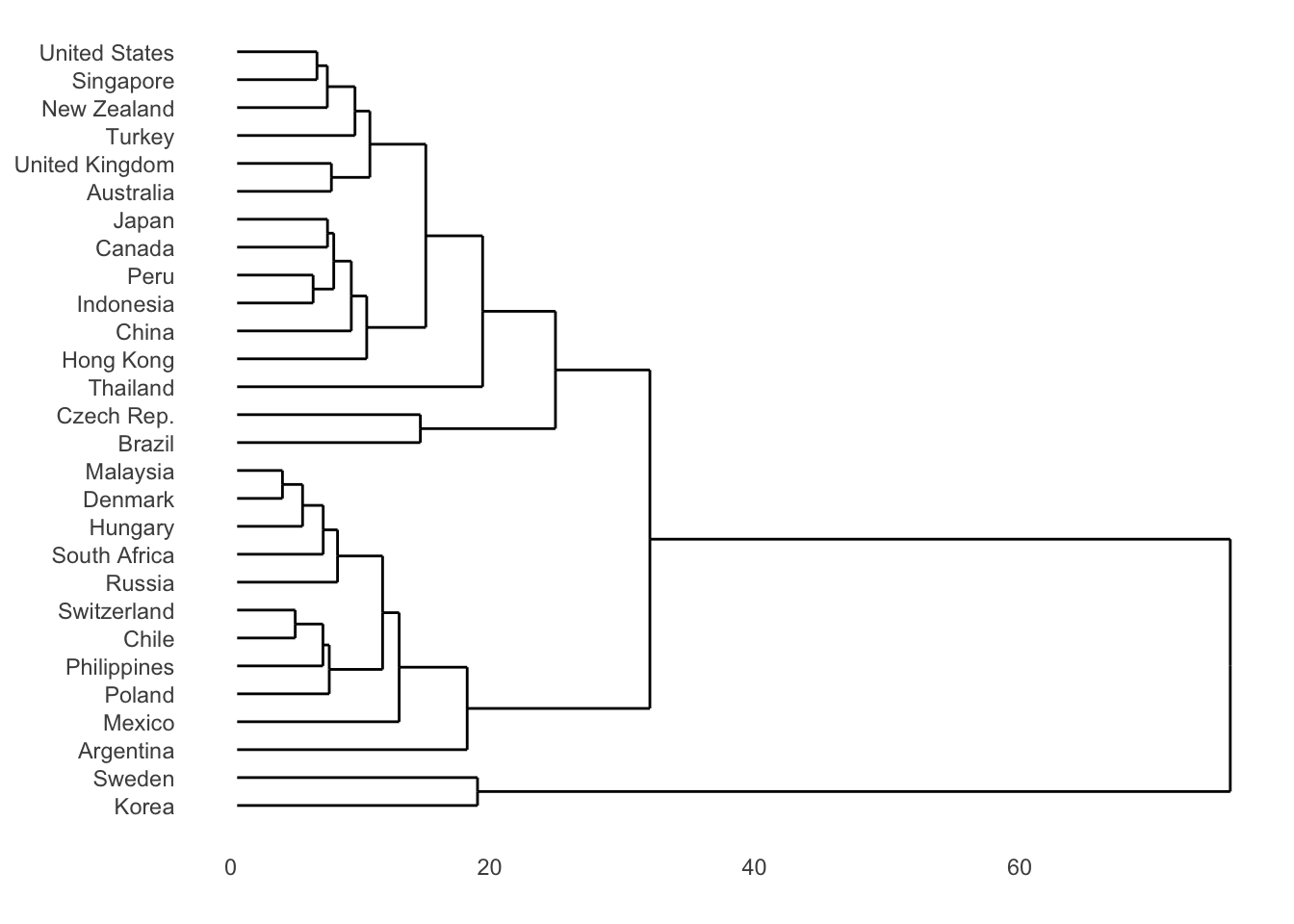
or an easier way:
plot(clustering_result, type = "d",
labs.arg = list(title = "Clusters' centroids"))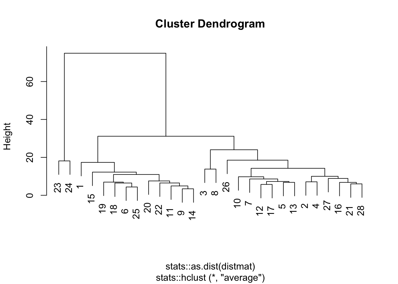
For K-means, plot the centroid
clustering_result <- tsclust(list_matrices_per_country,
                             type = "partitional", # "hierarchical", "partitional"
                             k = 5,
                             distance = "dtw2", #dtw, dtw2, lbk, lbi, sbd, gak
                             centroid = "mean", #“mean”, “median”, “shape”, “dba”, “pam”, “sdtw_cent”
                             seed = 2024)

plot(clustering_result, type = "c", linetype = "solid",
labs.arg = list(title = "Clusters' centroids"))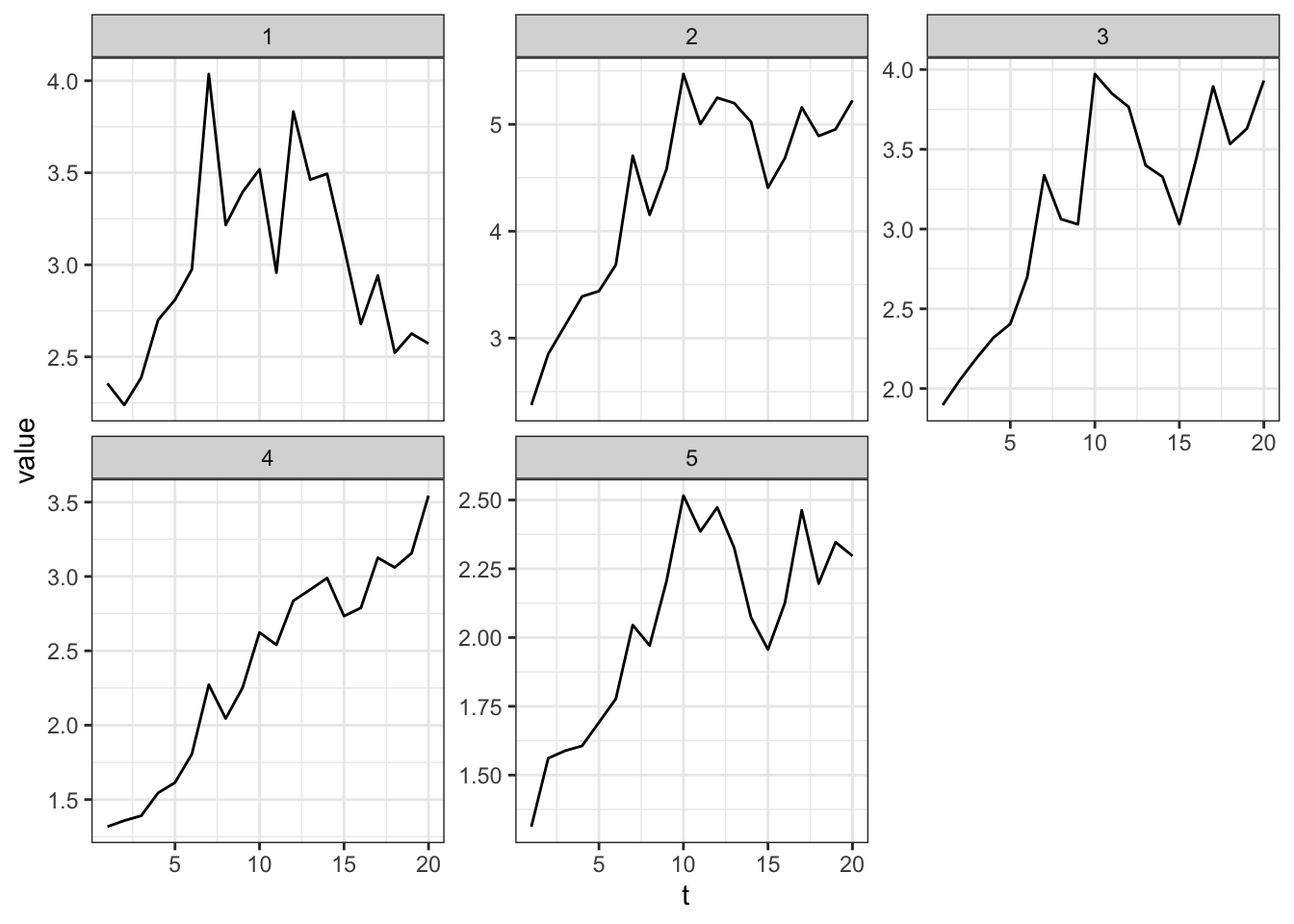
Clustering Results Visualization
visualize the assignment with a table
country_cluster country cluster
1 Argentina 1
2 Australia 2
3 Brazil 2
4 United Kingdom 2
5 Canada 2
6 Chile 1
7 China 2
8 Czech Rep. 2
9 Denmark 1
10 Hong Kong 2
11 Hungary 1
12 Indonesia 2
13 Japan 2
14 Malaysia 1
15 Mexico 1
16 New Zealand 2
17 Peru 2
18 Philippines 1
19 Poland 1
20 Russia 1
21 Singapore 2
22 South Africa 1
23 Korea 3
24 Sweden 3
25 Switzerland 1
26 Thailand 2
27 Turkey 2
28 United States 2visualize the assignment with a node diagram
root_node <- data.frame(cluster = unique(country_cluster$cluster))
edges_cluster_country <- country_cluster %>%
  select(cluster, country) %>%
  rename(from = cluster, to = country)

edges_root_cluster <- data.frame(from = "", to = root_node$cluster)
edge_list <- rbind(edges_root_cluster, edges_cluster_country)
mygraph <- graph_from_data_frame(edge_list)

# Plot
ggraph(mygraph, layout = 'dendrogram', circular = FALSE) +
  geom_edge_diagonal() +
  geom_node_point(color="#ffcc00", size=3) +
  geom_node_text(aes(label=name), hjust="inward", nudge_y=0.5) +
  theme_void() +
  coord_flip() +
  scale_y_reverse()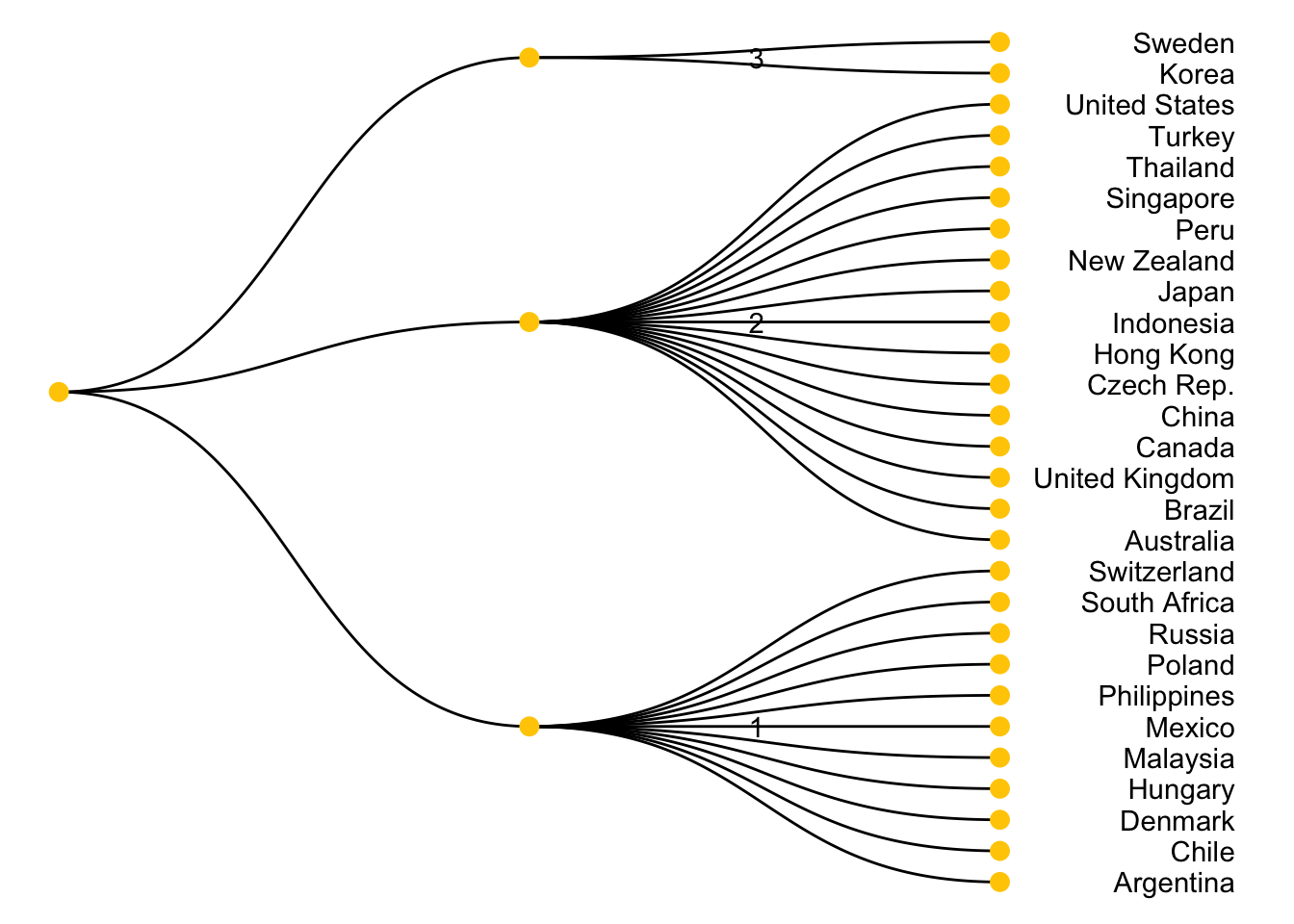
visualize the distribution of clustering assignment with a bar chart
cluster_summary <- country_cluster %>%
  group_by(cluster) %>%
  summarise(Count = n())

ggplot(cluster_summary, aes(x = cluster, y = Count)) +
  geom_bar(stat = "identity", fill = "#ffcc00", color = "#ffcc00") +
  geom_text(aes(label = Count), vjust = -0.5, color = "black") +
  theme_minimal() +
  labs(title = "Number of Countries per Cluster",
       x = "Cluster",
       y = "Number of Countries") +
  theme(axis.text.x = element_text(angle = 45, hjust = 1))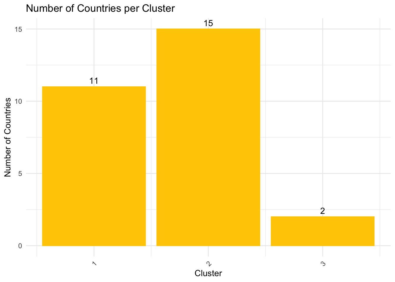
visualize the clustering results back with the trend line graph
merged_df <- merge(bmi, country_cluster, by = "country", all.x = TRUE)

p <- ggplot(merged_df, aes(x = year, y = bmi_usd_price, color = country)) +
  geom_line() +
  facet_wrap(~ cluster, scales = "free_y") +
  theme_bw() +
  theme(legend.position = "bottom",
        legend.title = element_blank())

# Convert to an interactive plotly object
p_interactive <- ggplotly(p, tooltip = c("country", "y", "x"))

# Show the plot
p_interactive